SKODA_Storyboard_3200x480_banner_ELROQ_animace-EN_40b205ba

SKODA_Storyboard_2050x480_banner_ELROQ_animace-EN_9df3b916

SKODA_Storyboard_1600x480_banner_ELROQ_animace-EN_23274338

Hidden figures of design: help you get along with your car

Hidden figures of design: help you get along with your car

You see their work in your car every day, without even realising it. That’s because the designers on the HMI team work to make your ŠKODA car easy to use.

5. 8. 2021 Škoda World DESIGN

The lights on the dashboard, the pictograms on buttons, the instrument panel, or the appearance and functioning of the infotainment user interface. All this and many other details have to be designed by someone. At ŠKODA, this is the task of the young HMI design team, which was established around five years ago. Today, it employs eight people. The team does not design the actual levers, buttons or infotainment, but how the individual elements look and react to user instructions.

Designers from ŠKODA’s HMI team with the VISION iV concept.

The speed of development of HMI (human-machine interface) has only picked up in car companies relatively recently with the advent of digitalisation, which has brought a shift away from the traditional analogue dials and the obligatory radio. The interface is becoming an important part of brand identity. “At the same time, user interfaces and the user experience are areas with huge potential for innovation: we can create the future here and understand the needs of users,” says Federico Fachini, Head of HMI Designers.

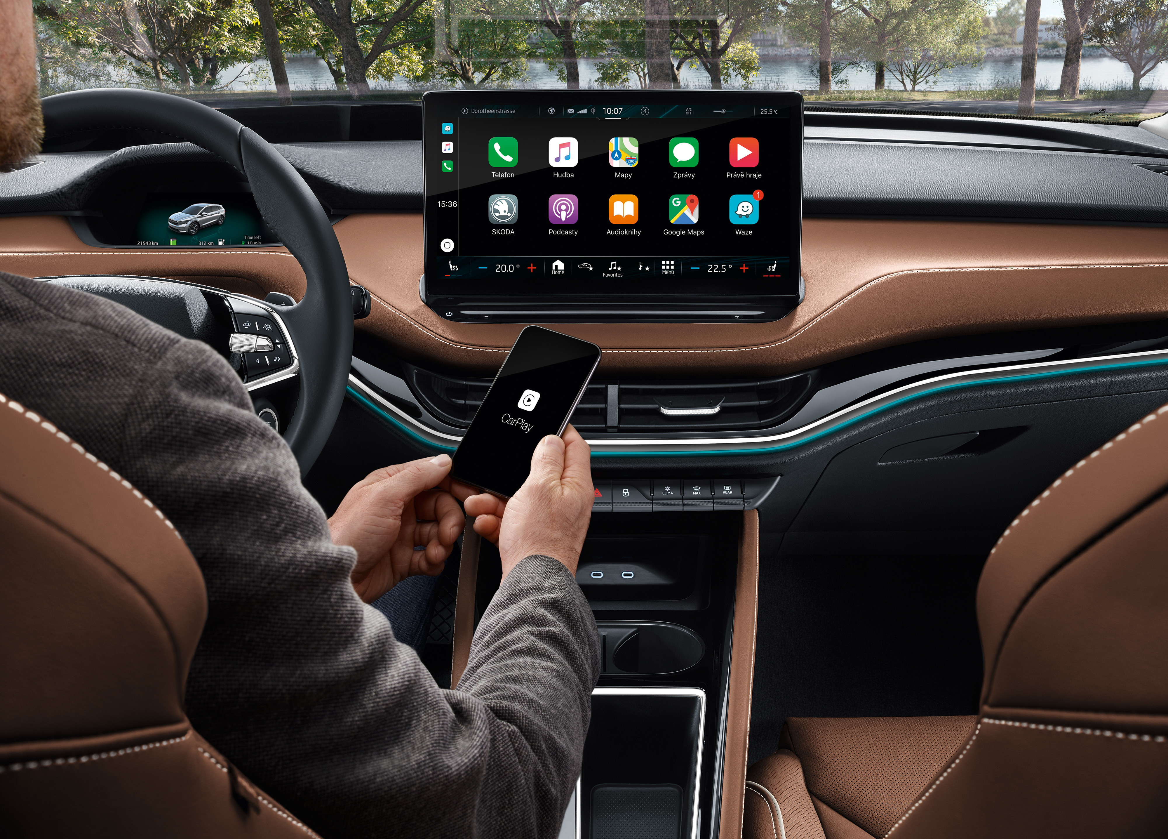
The infotainment system of the ŠKODA ENYAQ iV SUV reacts to its users’ habits and requirements.

New control logic

So what the HMI team is working on today and what it wants to achieve will only be seen in some future ŠKODA models. “We are working on a completely new solution that will support the brand identity and is based on the needs of our customers. Volkswagen Group’s new strategy in this area is making this possible,” says Federico. And he says we have a lot to look forward to. “Our team has designed a completely new logic, a new structure that will make it easier to operate the car’s various elements,” he explains. We will see a modern solution based on the ability to customise the environment according to our own preferences and in a way that lets us install apps.

Communication between people, mobile phones and cars is a standard feature today.

When working on the logic and appearance of interaction systems for the driver and passengers, the HMI team collaborates with other departments responsible for other parts, such as the instrument panel, infotainment or voice control. But the work goes beyond that, with HMI designers co-creating the brand’s visual identity in other areas, such as mobile apps and websites.

At the same time, the team has to develop all its solutions with customers around the world in mind. “The habits and needs of customers in China, India, Germany, the UK or Italy are very different, but we have to maintain a consistent visual style and logic. After all, the iPhone is also basically the same iPhone everywhere – and our task is quite similar,” explains Federico Fachini. To do this, he has a close-knit team at his disposal. “It’s not just about having graphic designers. You need to have people in the team with different knowledge, skills and experience. It’s like in football, where each player also has a slightly different task,” smiles Federico.

741_23_SKO_SB_banner_Design_EN_5856936f

The eight HMI designers at ŠKODA 

Federico Fachini

The head of ŠKODA’s HMI team was born in Milan and studied in Switzerland. He has worked in automotive companies, but also has experience of freelance work. “On the other hand, I’ve always enjoyed working in car companies,” he says. He has been working for ŠKODA since 2007. He first worked in exterior design, then in the Color & Trim department, and five years ago he was instrumental in the creation of the HMI team, which he has led since 2017. “Back then there were three of us, today there are eight of us and we have a lot of work ahead of us,” he says, adding, “I like to find out what the customers’ real needs are – that’s what I learnt during my freelance career. And I think that’s really useful for us today.” He then goes on to say that his main role in the team is to provide his “players” with the peace of mind they need to work. “I’m there for them. I give the team a lot of freedom, but also a lot of responsibility,” he adds.

Federico-Fachini

Ján Rehák

Ján started out at ŠKODA as a UI designer in the interior design department. This was before the formation of the HMI team which he co-founded and where he continues his work as a UI designer today. “At the moment, our main task is to complete the so-called design system, which will determine the rules of visual identity and structural logic, not only for in-car displays but for all ŠKODA digital products,” he says. This, he says, will greatly facilitate and speed up the development of specific solutions. 

Jan-Rehak

Daniel Hájek

He is responsible for designing the visual style and collaborates on the creation of concept cars. “In these, we can test our ideas and gradually align them with what suits our customers,” says Daniel, who is also one of the founding members of the HMI team. He says testing with customers is extremely important and it’s something the team puts a lot of effort into. Some testing is done internally, but also with a real sample of customers. “Based on these tests, we make the necessary changes to the visual style. For example, if something in the tests is not understood by the vast majority of customers, we have to rework it into a more understandable form,” he explains.

Daniel-Hajek

Wojciech Piekarczyk

Simply put, Wojciech Piekarczyk’s work deals with animations. “These have often been missing so far, but they are important. Animations can help the user understand the logic of the controls, specific functions and other small details. But on the other hand, they must not be distracting,” he says, explaining that his work is a kind of balancing act on a somewhat blurry edge. His work also includes welcome and goodbye animations, which the user can see when unlocking the car, for example. He also worked on the animation of the digital assistant Laura.

Wojtek-Piekarczyk

Rex Sander

He modestly describes his work as the easiest in the team. “I’m in charge of visualisation,” he says. What does that entail? Visually rendering all the information and controls, which isn’t actually all that simple. “In cars, we work with hardware that is significantly weaker than in computers or mobile phones,” he explains, adding that there are reasons for this linked to the development cycle and reliability requirements. But this doesn’t allow the use of such rich graphic elements, Rex says. “So I have to look for solutions that allow us to achieve beautiful results even with the hardware we have available,” he explains. One way to do this, he says, is to have strong contrasts and also a bit of colour.

Rex-Sander

Matej Dubiš

He found himself at ŠKODA thanks to the carmaker’s cooperation with the Faculty of Architecture and Design in Bratislava. In the HMI team he is a kind of liaison officer for colleagues who work on car ergonomics, i.e. the interior architecture department. His task is to ensure that all the “non-digital” controls in the car, i.e. the traditional buttons, levers and other controls, are comprehensible. “We make cars for a wide range of customers, but mostly the more traditional ones. That’s why we want to keep the physical controls, but that doesn’t mean we won’t innovate in this respect as well,” Matej says.

Matej-Dubis

Klára Sejkorová

Klára originally started in the HMI team as an icon designer, but today she is responsible for the complete design of the dashboard. Instrument panels are increasingly fully digital. “My job is to ensure that all the necessary information is displayed in a clear way. To ensure, for example, that the indicator lights do not distract the driver in any major way, but at the same time are clearly visible and understandable,” he explains. So Klára has to tackle some tricky details: does the driver need to have the odometer displayed on the digital instrument panel at all times? Or does it only need to be displayed in certain situations? Which ones? “I then see the overall design through to the production phase,” adds Klára.

Klara-Sejkorova

Aneta Kalousová

Aneta, the newest member of ŠKODA’s HMI team, took over the icon work from Klára. “Icons are all around us, and often we don’t pay any attention to them. But that’s the point. They have to express their function clearly and comprehensibly, while remaining unobtrusive,” Aneta describes the basic philosophy. The icons in ŠKODA cars should have a uniform style, she says, but it must also be possible to gradually modernise them. “We are very interested in the practical experience of our customers in this respect,” she adds.

Aneta-Kalousova

Related Stories Based on tags: 2021, design, interior