Evergreen identity
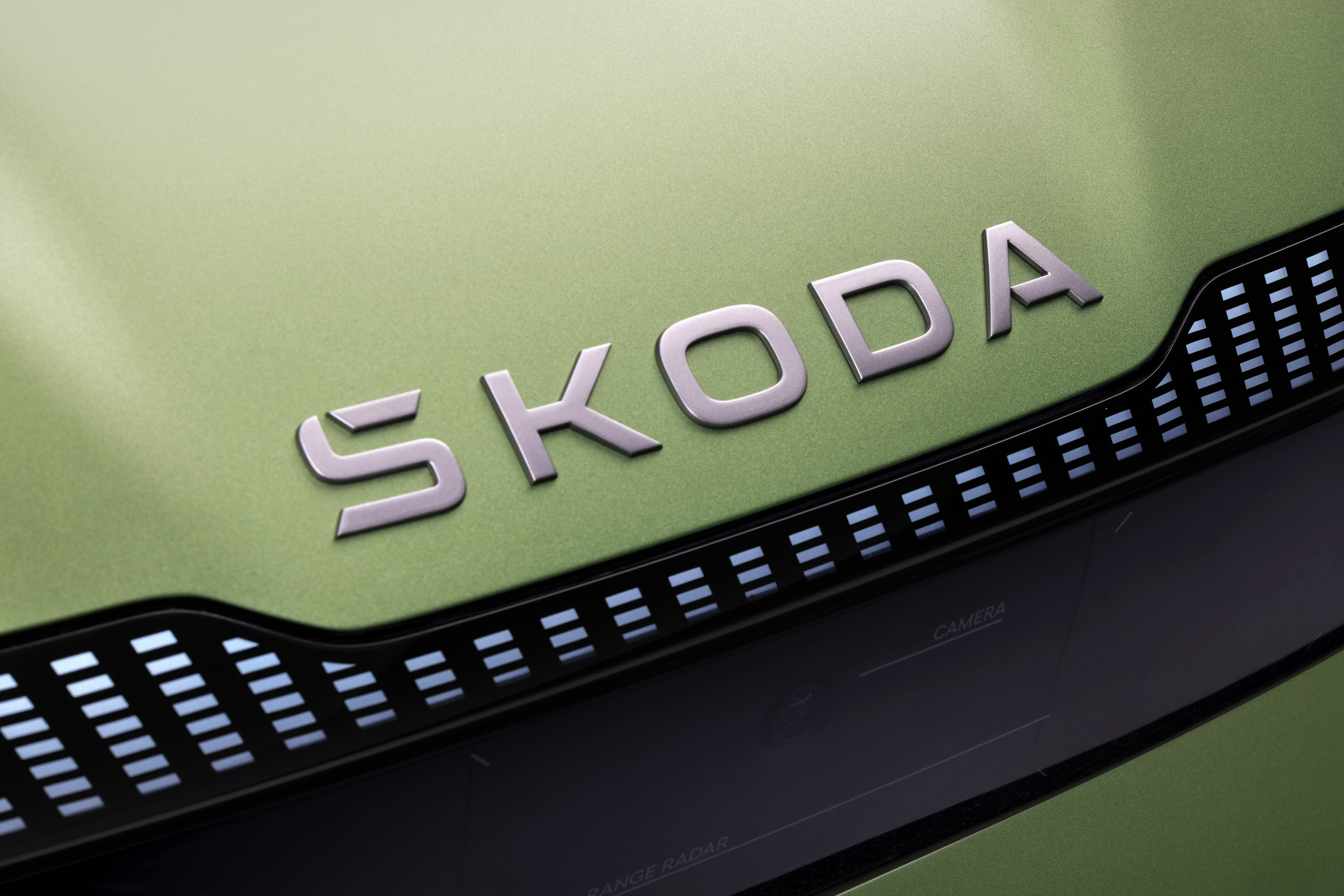
In addition to the new graphic design, the branding has undergone other changes. The company will now use the ŠKODA name and traditional winged arrow in a ring more separately, with the name becoming the main communication tool. This typographic logo will appear not only on the rear of ŠKODA cars, as it has in recent years, but also on the front.
 The new logo on the front of the car
In order to make it more expressive, the word ŠKODA was given a new look with an integrated “hook” accent over the letter S, working with symmetry and a combination of curves and edges. “The accent was a challenge for us: from a global perspective it tends to be confusing for most of our customers. In the new form, this symbol will be integrated and blend in with the symmetry of the logo, while customers in the domestic market and some others will still recognise it in the lettering,” says Martin Pavlík, the second member of the marketing team that prepared the new brand identity.
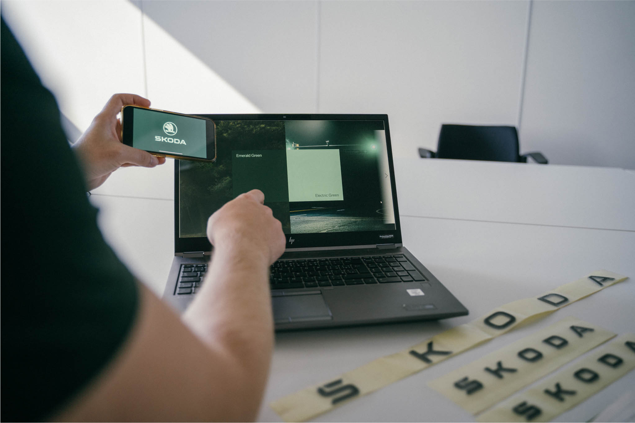
 The new logo and its colour scheme work better with mobile devices.


